Thursday, 8 March 2012

Final edit

For my final outcome I wanted an image that was bold and delivered the message I wanted. The message I wanted to get across is that viewers are being manipulated when viewing skincare ads through a perfect perception of beauty which is false, because of the post production used to get flawless facial features. 
There are many flaws with skincare ads for example...
  1. Women models are being manipulated through what photographers/ editors to in post production, and sometimes the models are unaware of this
  2. Women look at themselves in different way because of the way these models look, it can spark insecurity
  3. Men have a high expectation of how women should look
  4. Perception of "perfection" and beauty changes through time


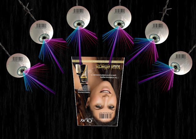
This is my chosen final photoshop composite. In the previous post I posted all of the choices for my final, I then asked for some advice on which to pick on our  Facebook page, the overall favourite was this one. I like this edit because of the following...

  • I have included quotes/ statistics/ phrases that are frequently used by skincare product campaigns. In the original edit these phrases were a lot more bold. I have applied a smaller transparency of the text layers, for my final because I don't want it to control the viewers gaze. 
  • The lazers have worked well in showing the destructive nature of viewing these adverts
  • The use of the distort and perspective tool has made it look as the eye balls are looking at the ad
  • The barcode shows viewers identitys are being covered distorted through the falseness of the ads
  • Barbed wire evokes a danger/ the controlling nature of these ads
  • Black background helps to create a bold overall image

Monday, 5 March 2012

Final edit choices


Another edit...


I think I prefer this edit from my previous, although very similar, the direction of the eyes helps to show how adverts draw in their viewers. My only concern with the edit is that the barbed wire may be a little pixelated when I print it A3. I may attempt to add some phrases/ quotes/ statistics that I tried in the previous post to add more information to the composite. The barbed wire evokes control.

Adding statistics quotes from advertising campaigns...


In this edit I have used the last edit, which will be the base of my final edit and added statistics/ quotes from advertising campaigns. To get these words/ phrases I looked on skincare product websites and observed how they used these sentences to grab their customers, and sometimes these can be exaggerated.

Phrases I have used included are-

  • For a radiant glow
  • Luxurious
  • Moisturises all day long
  • Powerful anti-ageing effects
  • Hydrates skin for firmer appearance
  • Easily absorbed
  • 70% of women agree
I think most of these phrases are predictable when looking into advertisements. 

I have placed them in all of the eyes in my edit, showing that the viewers take these phrases in and are often seduced by them. 

Another experiment using text...


This time I have added the text to the black background, this has made the background more key. The phrases stand out. However I'm not sure it has the same effect as the first text edit, as it doesn't come over as corruptive.


Sunday, 4 March 2012

Final composite proccess

In my final image I want to create a strong message of how advertising campaigns corrupts the perception of viewers particularly on beauty. I want to create a similar image to my previous edits but adapt it in some areas, particularly because it needs to be A3. Below are the steps I'm taking to reach my final piece...

  • For the fist step I produced a new image sized 420 by 297mm with a DPI of 300, this will allow me to produce an A3 print out with no pixelation. 
  • For my final composite I want to use a black background to create an eye catching image that will make layers stand out. I selected the red circled background as seen below. 


  • I wanted an eyeball in my composite that would contain visible veins to show the strain on viewing ads. I struggled to find a large enough image of an eyeball on Google. Therefore I used the same eyeball from my last edits, it was just large enough, but I would have to use more of them because of the smaller scale I would need to use them in. Having many of these eyes would work successfully becuase of the destructive nature on a large number of magazine readers. So to add this to my black image I needed to select the circular edge of the eye, I did this using the quick selection tool, then I moved it onto my final composite image file. 

  • I then used the transform tool to turn the eye towards where an ad will go in the bottom centre. 


  • I then needed to duplicate the eye selection 5 times as I wanted 6 eyes in total. I did this by right clicking on the layer and pressing duplicate layer, I then transformed them to turn them towards the same point as I did the first eye.


  • Here is the result, when all eyes are in place...


  • I then added barbed wire to the eyes as if hanging/ being controlled. The barbed wire was fairly easy to select due to the white background in the original image so therefore was able to use the magic wand tool and invert the selection


  • I wanted to us the same lazer in the image, as the colour stands out. The reason for choosing to use the ideas of layers becuase it reinforces looking at these beauty ads has a bad effect to the viewers perspective and is rather destructive. I selected the lazer using the magic wand tool. I will go back at the end of putting the composite together and use a mask to tidy up the selections. 


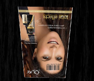
  • This is my chosen ad for the composite, I wanted a large sized file that was a popular skincare brand. 


  • I wanted to distort my chosen ad to give the impression of it being read by the eyes. I did this using the distort  and perspective tool. I have turned it upside down to reinforce it being their viewpoint. 


  • Use of bar code to show identity of the viewers is being distorted. I again used the magic wand for selection. 


I placed the barcode on both the eyes and the ad model, to show that by viewing the ad the viewers identity is becoming controlled along with their perspective.


This is the result of combining the above components/ layers. I think it is still missing something however so I will continue to explore removing/ adding extra components to make my message come across even more. 

Components I may want to now consider...
  • Use of text- in a previous trial I used quotes and statistics used by these type of advertising campaigns, I may want to contemplate this, but placement will be important
  • More that one ad, to exaggerate how many advertising campaigns have the same effect


Saturday, 3 March 2012

Final composite ideas

Now I have done a number of experiments using both cut and paste methods and more importantly Photoshop I now need to pull together ideas that I have addressed and create an A3 Photoshop composite. I have looked at the following ideas throughout my project:-
  • camera as advancement of a photographers eye
  • the manipulation of models in advertising campaigns
  • the manipulation of viewers when they see adverts that have been retouched
For my final composite I want to continue to address my final idea of how customers and viewers of skincare adverts are being manipulated by the false image being brought across. My most recent edits have been eyes onlooking these skincare ads, and I want to continue this concept. I want to use similar visual ideas but need to address any issues with the images I am using becuase I need to make the image A3. This will mean I need to carefully select large files to prevent Pixelation when printing. 

Visual components to include in final composite:-
  • eyeball with visible veins to show a strain when looking at the ads
  • skincare ad- maybe one that has had retouching and has been criticised for it?
  • barcodes to show a viewers identity becoming enhanced by what they view
  • barbed wire- to show bad effect
  • lazers- bad effect of viewing
  • quotes and statistics about the products being advertised and how this influences viewers
  • bold dark background- to make it visually stand out- link to montages of Peter Kennard


Chen Man at Chinese Art centre

We recently visited an exhibition by Chen Man at the Chinese art centre. I thought I would include it on here becuase of the post production used in many of her photographs. It was her first solo exhibition capturing the consumer culture in China and the spirit of a post 1980's generation. She is a leading fashion photographer in China capturing surreal photographs of the women in China. All of the works featured in the gallery were produced from 2003.


This is one of the works featured in the exhibition from Vision magazine. 


Her photographs are very striking becuase of the colours used and imagination seeked within each. They deliver a dream like observation of China and its women.