- For the fist step I produced a new image sized 420 by 297mm with a DPI of 300, this will allow me to produce an A3 print out with no pixelation.
- For my final composite I want to use a black background to create an eye catching image that will make layers stand out. I selected the red circled background as seen below.
- I wanted an eyeball in my composite that would contain visible veins to show the strain on viewing ads. I struggled to find a large enough image of an eyeball on Google. Therefore I used the same eyeball from my last edits, it was just large enough, but I would have to use more of them because of the smaller scale I would need to use them in. Having many of these eyes would work successfully becuase of the destructive nature on a large number of magazine readers. So to add this to my black image I needed to select the circular edge of the eye, I did this using the quick selection tool, then I moved it onto my final composite image file.
- I then used the transform tool to turn the eye towards where an ad will go in the bottom centre.
- I then needed to duplicate the eye selection 5 times as I wanted 6 eyes in total. I did this by right clicking on the layer and pressing duplicate layer, I then transformed them to turn them towards the same point as I did the first eye.
- Here is the result, when all eyes are in place...
- I then added barbed wire to the eyes as if hanging/ being controlled. The barbed wire was fairly easy to select due to the white background in the original image so therefore was able to use the magic wand tool and invert the selection
- I wanted to us the same lazer in the image, as the colour stands out. The reason for choosing to use the ideas of layers becuase it reinforces looking at these beauty ads has a bad effect to the viewers perspective and is rather destructive. I selected the lazer using the magic wand tool. I will go back at the end of putting the composite together and use a mask to tidy up the selections.
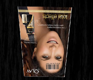
- This is my chosen ad for the composite, I wanted a large sized file that was a popular skincare brand.
- I wanted to distort my chosen ad to give the impression of it being read by the eyes. I did this using the distort and perspective tool. I have turned it upside down to reinforce it being their viewpoint.
- Use of bar code to show identity of the viewers is being distorted. I again used the magic wand for selection.
I placed the barcode on both the eyes and the ad model, to show that by viewing the ad the viewers identity is becoming controlled along with their perspective.
This is the result of combining the above components/ layers. I think it is still missing something however so I will continue to explore removing/ adding extra components to make my message come across even more.
Components I may want to now consider...
- Use of text- in a previous trial I used quotes and statistics used by these type of advertising campaigns, I may want to contemplate this, but placement will be important
- More that one ad, to exaggerate how many advertising campaigns have the same effect


No comments:
Post a Comment